PURPOSE
VT OneCampus is an enterprise level application at Virginia Tech that allows web users to search/browse for university web services and mobile applications. Services are represented in VT OneCampus as ‘task tiles’, and each tile has a task icon to visually represent certain aspects about the task function and purpose.
In order to present a consistent and cohesive visual experience for the end user, this document establishes some basic guidelines for the visual design of task icons.
Icons should be complex enough to properly represent the object which represents the service. However, complexity can also undermine the abstraction. These icons show the appropriate level of skeuomorphism.


COLOR PALETTE
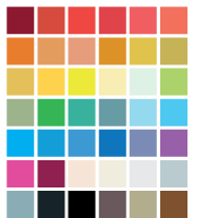
The VT OneCampus color palette can be found with hex-codes included in the corresponding document on the site page. If you would like to select colors directly from the color palette, a smaller version is included here. Copy it to whichever design software you are working in and use the program’s eyedropper/color selection tool to select colors directly from the image.
For a more detailed OneCampus color palette, click here.
COLOR USAGE
Combinations
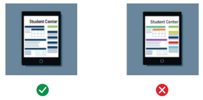
When designing an icon, it is recommended to limit the color selection to 3 primary colors (and their lighter/darker variants).
Contrast
All icons should have a solid color background, and there should be enough color contrast between the background and the design assets to clearly communicate the design. As a general rule, avoid white and light colored backgrounds.
Icons should remain identifiable with a contrast ratio of 4:5:1 when viewed achromatically

SIZING
Canvas Padding
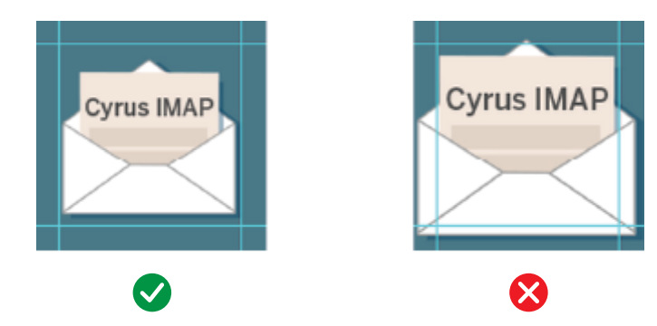
When design an icon, there should be padding between the design assets and the edge of the canvas.
Dimensions
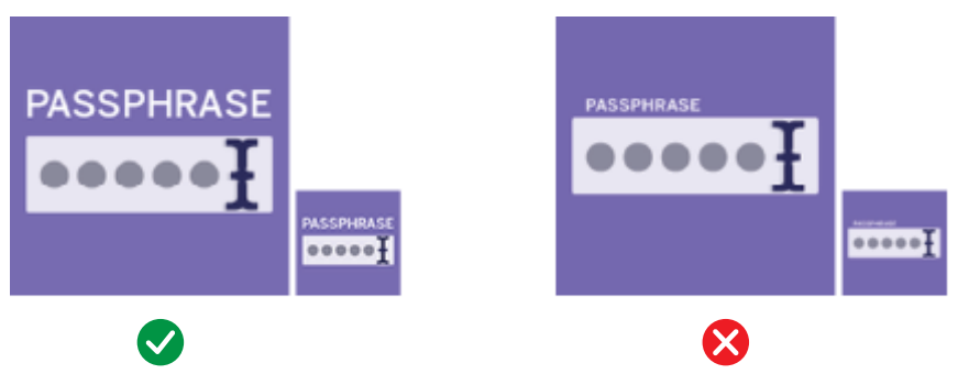
In VT OneCampus, icons are rendered in various sizes to accommodate many different browsers and devices. Icon designs must visually render with an adequate clarity at the smallest size as it does the largest. Make sure that all design assets and typography are clearly visible and legible at all dimensions. As of this writing, the following native and adaptive dimensions are supported:
- 153x153 px (native)
- 144X144 px
- 90x90 px
- 72x72 px
- 31x31 px
- 740x236 px (Carousel Image)
Art direction is available for images so that you can develop complementary but technically different images for the desktop and mobile sizes.
DROP SHADOW
When using drop shadow styling for an icon, the shadow style should not use gradient colors or ‘fuzzy’ edges. The shadow should correspond to the exact geometric shape of the parent element, and positioned slightly offset down and to the right to simulate light coming from above (via xy coordinates) to create the shadow effect.

TYPOGRAPHY
For Icons that include typography, one of the font families at right should be used as the font face.
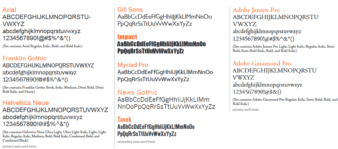
PROPRIETARY ICONS
Some services that may be found in VT OneCampus are identified by a proprietary icon or logo related to that service. Proprietary designs are okay to use in icon designs under the following conditions:
- the service is powered by the software represented by the logo or trademark
- the use of the service is exclusively dependent on the proprietary software represented in the logo. However, the proprietary logo must not be represented as the primary design element in the tile icon design
- the usage conforms to any usage guidelines provided by the proprietary logo/trademark owner

HELP?
The team of designers is available to consult with anyone desiring further guidance in the process of creating an effective task icon. Inquiries can be sent to onecampus@vt.edu


